# Web design tips for beginners: 10 rules and the reasons behind them
> Web design tips for beginners: a clear hierarchy, readable type, WCAG contrast, a phone-first layout, fast images, simple forms and testing with real users.
- URL: https://computese.com/top-design-tips-for-2024-for-starter/
- Author: Duong Quan Nguyen, CEO, Computese
- Published: 2024-08-03
- Updated: 2026-09-25
- Topics: Web development
## In short
- Good web design for beginners is a short list of rules you can check: one job and a clear hierarchy per page, readable text, enough contrast, a phone-first layout, visible navigation, light images, simple forms and reusable components.
- WCAG 2.2 supplies the numbers: text contrast of at least 4.5:1 (3:1 for large text and the visible parts of controls), pointer targets of at least 24 by 24 CSS pixels, a visible keyboard focus, and content that reflows at 320 CSS pixels.
- Speed is part of the design. Core Web Vitals call a page good when LCP is within 2.5 seconds, INP is 200 milliseconds or less and CLS is 0.1 or less, measured at the 75th percentile of real page loads.
- Automated checkers miss problems that only people reveal. Watch five representative users try real tasks while thinking aloud, fix what stopped them, and test again with five more.
The web design tips that matter most for beginners are the ones you can check: give each page one job and a clear visual hierarchy, set readable body text, meet WCAG 2.2 contrast minimums, design the phone layout first, keep navigation visible, cover accessibility basics, keep images light, simplify forms, reuse components and test with real users.
None of these is a matter of taste. Each rule below comes with the reason it exists and, where there is one, the standard or study behind it: the W3C's Web Content Accessibility Guidelines (WCAG) 2.2, Google's Core Web Vitals and usability research from Nielsen Norman Group (NN/g). The rules follow the order you meet them when building a page, from the content to launch, and a checklist at the end collects the numbers. How the site behind the design is built, launched and maintained is covered in our [web development guide](https://computese.com/web-development-guide/).
## Give every page one job and a clear visual hierarchy
Before choosing colours or fonts, decide what each page is for: the one thing a visitor should understand, and the one action they should take next. Everything else on the page either supports that or goes. A page that tries to do five things gives every element the same weight, and the visitor has to work out the order alone.
Visual hierarchy is how you make that order visible. [Nielsen Norman Group](https://www.nngroup.com/articles/visual-hierarchy-ux-definition/) defines it as arranging a page so the eye takes in each element in order of importance, and names three tools for it:
- **Scale.** Bigger elements attract attention first, so the most important one is the biggest. NN/g suggests working with about three type sizes (heading, subheading and body) and no more than two large elements in a view, so they still stand out.
- **Colour and contrast.** Saturated or high-contrast elements advance and muted ones recede. If everything is emphasized, nothing is.
- **Grouping.** Related items sit close together, and separate groups get more space between them, or a border or background when space alone is not enough.
People scan before they read. In eye-tracking research it first reported in 2006 and revisited in 2017, [NN/g found](https://www.nngroup.com/articles/f-shaped-pattern-reading-web-content/) that on pages with little formatting, readers make one or two horizontal sweeps near the top and then scan down the left side: an F-shaped pattern that skips whatever sits at the right of a long paragraph, on phones as well as desktops. The remedy is structure. Put the most important points in the first two paragraphs, make headings look clearly more important than body text, start each heading with the words that carry its meaning, and use lists for items and steps.
> [!TIP]
> Run the squint test: blur a screenshot of your design, or squint at it, until you cannot read the text. Whatever still stands out is what visitors will notice first. If that is not the main message or the main button, the hierarchy needs work.
## Set body text people can read without effort
Most of a web page is text, so readable type does more for a first site than any choice of font. The settings that matter are size, line length, spacing and the steps between levels.
- **Size.** Keep body text at the browser default or larger. That default is usually 16px, according to [MDN's font-size reference](https://developer.mozilla.org/en-US/docs/Web/CSS/Reference/Properties/font-size), and readers with limited vision may set theirs much larger. Size text in `rem`, relative to that default, rather than in `px`: MDN notes that pixel font sizes are not accessible because some browsers do not let the user change them. WCAG 2.2 also requires that text can be resized to 200% without losing content or functionality (success criterion 1.4.4).
- **Line length.** Keep lines to about 80 characters or fewer. WCAG's AAA criterion for [visual presentation](https://www.w3.org/WAI/WCAG22/Understanding/visual-presentation.html) sets 80 as the maximum (40 for Chinese, Japanese and Korean), because people with some reading or vision disabilities lose their place on long lines. [web.dev](https://web.dev/articles/responsive-web-design-basics) cites the classic guidance of 70 to 80 characters per line, about 8 to 10 English words.
- **Spacing.** Set paragraph line height to about 1.5, the "space-and-a-half" the same criterion describes, and do not justify text: the uneven gaps between words make reading hard for people with some cognitive disabilities. At level AA, WCAG 2.2's text spacing criterion (1.4.12) requires the page to keep working when a reader forces a 1.5 line height and wider letter, word and paragraph spacing, so avoid fixed-height boxes around text.
- **Steps between levels.** A heading that is only slightly larger than body text reads as body text. Make each level clearly different in size or weight, and keep the number of levels small.
- **Few typefaces.** Use one family for text and at most a second for headings. Each weight and style is another file to download: the HTTP Archive's [2025 Web Almanac](https://almanac.httparchive.org/en/2025/page-weight) notes that custom fonts can add several hundred kilobytes when several weights are used, and [web.dev explains](https://web.dev/articles/font-best-practices) that a font that has not loaded yet can delay text from appearing, while swapping it in can shift the layout. Serve fonts as WOFF2 and load only the weights you use.
A starting point in CSS:
```css
html {
font-size: 100%;
} /* respect the reader's default size */
body {
line-height: 1.5;
}
p,
li {
max-width: 70ch;
} /* short lines: check for 80 characters or fewer */
h1 {
font-size: 2.5rem;
line-height: 1.15;
}
h2 {
font-size: 1.75rem;
line-height: 1.25;
}
h3 {
font-size: 1.25rem;
}
```
## Choose colours that pass WCAG contrast minimums
Low-contrast text is the accessibility failure that automated scans find most often. In [WebAIM's February 2026 scan](https://webaim.org/projects/million/) of the top one million home pages, 83.9% had text below the WCAG 2 AA contrast thresholds, with 34 instances per page on average. It is also the easiest failure to prevent, because you can check every colour pair before any code is written.
A contrast ratio compares the relative luminance of two colours on a scale from 1:1 (no contrast) to 21:1 (black on white). [WCAG 2.2](https://www.w3.org/TR/WCAG22/) sets these minimums at level AA:
| What | Minimum contrast (AA) | WCAG 2.2 criterion |
| --------------------------------------------------------------------------------------------------------- | ---------------------------- | ------------------------ |
| Body text and most interface text, including placeholder text | 4.5:1 | 1.4.3 Contrast (Minimum) |
| Large text: at least 18pt (about 24px), or 14pt bold (about 18.5px) | 3:1 | 1.4.3 Contrast (Minimum) |
| Parts of controls needed to see them and their state (field borders, focus indicators) and chart graphics | 3:1 against adjacent colours | 1.4.11 Non-text Contrast |
The 4.5:1 figure is not arbitrary. The W3C's [explanation of the criterion](https://www.w3.org/WAI/WCAG22/Understanding/contrast-minimum.html) says it compensates for the loss of contrast sensitivity that comes with vision of about 20/40, commonly reported as typical for people around 80 years old. The same page gives the pixel equivalents in the table and confirms that placeholder text counts as text.
Two more colour rules:
- **Never use colour alone to carry meaning** (WCAG 1.4.1, level A). About 1 in 12 men have a colour vision deficiency, most often one that makes red and green hard to tell apart, according to the US [National Eye Institute](https://www.nei.nih.gov/eye-health-information/eye-conditions-and-diseases/color-blindness). Mark errors with text and an icon as well as red, and required fields with an asterisk as well as colour (the example the W3C's [design tips](https://www.w3.org/WAI/tips/designing/) use), and underline links in body text.
- **Keep the palette small.** For straightforward designs NN/g suggests two primary and two secondary colours, and keeping warm, bright colours such as red for warnings and errors, so colour keeps its meaning.
Check every text and background pair with a contrast checker, including text over photos and button labels on hover. The W3C's design tips link a list of checking tools.
## Design the phone layout first, then widen it
Design for the narrowest screen first. It is where the constraints are tightest, it is the version Google reads, and it is also the layout people see when they zoom in.
- Google uses the mobile version of a site's content, crawled with its smartphone agent, for indexing and ranking: [mobile-first indexing](https://developers.google.com/search/docs/crawling-indexing/mobile/mobile-sites-mobile-first-indexing). Google recommends responsive web design, the same HTML at the same URL with a layout that adapts to the screen, as the easiest setup to build and maintain. The crawling side is explained in [how Google Search works](https://computese.com/how-google-search-engine-works/).
- WCAG 2.2's [reflow criterion](https://www.w3.org/WAI/WCAG22/Understanding/reflow.html) (1.4.10, level AA) requires content to work at a width of 320 CSS pixels without scrolling in two directions. That is what a 1,280-pixel-wide window becomes at 400% zoom, so a good one-column phone layout also serves readers who magnify the page.
In practice:
1. **Add the viewport meta tag.** Without it, [web.dev explains](https://web.dev/articles/responsive-web-design-basics), phones render the page at a desktop width, usually about 980px, and shrink it until the text is hard to read.
2. **Design the single column.** Stack the blocks in order of importance, because that is the order a phone user scrolls through them.
3. **Widen until it breaks.** Stretch the layout until lines get too long or blocks float in empty space, and add a breakpoint there. web.dev advises choosing breakpoints by content, not by device classes or brand names.
4. **Check the extremes.** Test at 320 CSS pixels, at 400% zoom and on a real phone, not only in a narrowed desktop browser.
```html
```
```css
.cards {
display: grid;
gap: 1.5rem;
}
@media (min-width: 40rem) {
.cards {
grid-template-columns: repeat(2, 1fr);
}
}
@media (min-width: 64rem) {
.cards {
grid-template-columns: repeat(3, 1fr);
}
}
```
With that approach the same content blocks, in the same order of importance, move from one column to two and then three as the screen widens. Nothing a phone user needs is missing, and the desktop layout adds space rather than content.
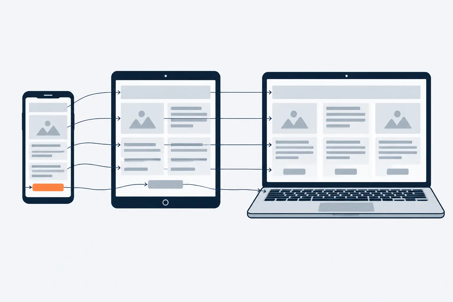
*Start with the one-column phone layout; wider screens only rearrange what is already there.*
## Keep navigation visible, labelled and in the same place
Navigation is how people recover when a page is not the one they wanted. Four rules cover most sites.
- **Show it on larger screens.** In a 2016 quantitative study, [NN/g measured](https://www.nngroup.com/articles/hamburger-menus/) what happens when the main navigation hides behind a menu icon. On desktop, people used hidden menus in 27% of cases, against 48% for visible navigation and 50% for partly visible "combo" navigation. On phones, hidden navigation was used in 57% of cases and combo navigation in 86%. On both, content discoverability dropped by more than 20% when the navigation was hidden. A menu button may be unavoidable on a phone, but carried to desktop it hides what people came for; on phones, show the most important links beside it where they fit.
- **Label with the words visitors use.** Headings and labels must describe their topic or purpose (WCAG 2.4.6). "Services" or "Pricing" says where a link goes; a clever name makes people guess. Link text should make sense on its own: WebAIM found ambiguous link text such as "click here" or "more" on 15.2% of home pages in 2026.
- **Keep it in the same place and order on every page** (WCAG 3.2.3, level AA). WCAG 2.2 added the same rule for help (3.2.6 Consistent Help, level A): contact details or a help link that repeat across pages stay in the same relative position.
- **Tell people where they are.** Mark the current page in the menu, add breadcrumbs on deep sites and offer a second way to find content, such as site search or a sitemap, as the W3C's design tips recommend. Add a skip link so keyboard users can jump past the menu to the main content (WCAG 2.4.1). WebAIM found one on only 17.1% of home pages, and one in ten of those did not work.
## Cover the accessibility basics beginners miss
WebAIM's 2026 scan found detectable WCAG 2 failures on 95.9% of home pages, and 96% of all the errors fell into six types: low-contrast text, missing image alt text, missing form labels, empty links, empty buttons and a missing page language. Most are a single design decision or a single attribute. Full WCAG compliance is a larger project; these are the basics a first site should get right.
### Write alt text for every image that carries meaning
Alt text is the text alternative in an image's `alt` attribute, which screen readers read out in place of the image. The W3C's [alt decision tree](https://www.w3.org/WAI/tutorials/images/decision-tree/) sets the rules:
- An image that informs gets a short description of what it conveys, not of every detail.
- An image inside a link or button describes where the link goes or what the button does.
- A decorative image, or one that repeats nearby text, gets an empty `alt=""` so screen readers skip it.
Google also uses alt text, together with computer vision and the page's content, to understand what an image shows, and [advises against](https://developers.google.com/search/docs/appearance/google-images) stuffing it with keywords. In WebAIM's 2026 scan, 16.2% of home page images had no alt text, and 45% of those were linked images, leaving those links with no description.
### Keep a visible focus indicator
People who use a keyboard instead of a mouse follow the focus indicator, the outline that moves as they press Tab. [Without one](https://www.w3.org/WAI/WCAG22/Understanding/focus-visible.html), a sighted keyboard user cannot operate the page, which is why WCAG 2.4.7 (level AA) requires it to be visible. The indicator counts as a visual part of a control, so it needs 3:1 contrast as well, and WCAG 2.2 added criterion 2.4.11 (level AA): content you add, such as a sticky header or a cookie banner, must not hide the focused element completely.
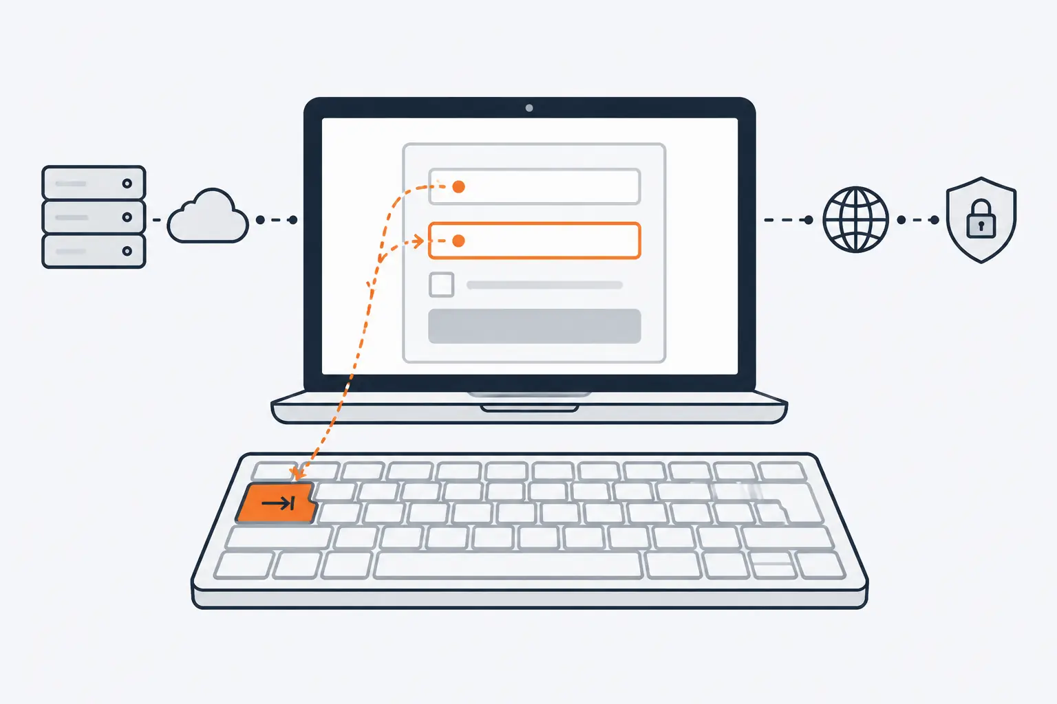
*For a sighted keyboard user, the focus ring is the only sign of where they are on the page.*
Browsers draw a focus outline by default, and may show it only when the keyboard is in use. If it clashes with your design, restyle it rather than remove it, so every link, button and field shows a clear ring as focus moves through the page:
```css
:focus-visible {
outline: 3px solid #0b57d0;
outline-offset: 2px;
}
```
> [!WARNING]
> Never set `outline: none` on links, buttons or fields without a replacement style. The page still looks fine in every review done with a mouse, and keyboard users can no longer operate it.
### Make targets big enough to hit
WCAG 2.2 added [Target Size (Minimum)](https://www.w3.org/WAI/WCAG22/Understanding/target-size-minimum.html) at level AA: anything people click or tap must be at least 24 by 24 CSS pixels, or spaced so that a 24-pixel circle centred on it does not overlap another target. Links inside a sentence and unstyled browser controls are exempt. The rule exists for people with hand tremors or limited dexterity, and people using less precise input devices, who otherwise hit the neighbouring control. The AAA version (2.5.5) asks for 44 by 44 CSS pixels. In practice, give icon buttons padding and do not pack small text links tightly together.
### Keep headings in order
Headings are the page's outline, and WebAIM describes them as the main way screen reader users navigate a page. The W3C's [headings tutorial](https://www.w3.org/WAI/tutorials/page-structure/headings/) says to nest them by rank and avoid skipping levels: an `
` should not be followed directly by an `
`. Choose the level by the structure and set the size with CSS; never pick `
` because it looks the right size. WebAIM found skipped heading levels on 41.8% of home pages in 2026, and no headings at all on 7.5%.
Finally, declare the page language (``, WCAG 3.1.1, level A), so screen readers [load the right pronunciation rules](https://www.w3.org/WAI/WCAG22/Understanding/language-of-page.html). WebAIM found it missing on 13.5% of home pages. For the full set of fixes and how to test them with a keyboard and a screen reader, see our guide to [improving website accessibility](https://computese.com/how-to-improve-website-accessibility/).
## Treat page speed as part of the design
Speed problems often start as design decisions: a full-width photo at the top of every page, four font families, an autoplaying video. Google's [Core Web Vitals](https://web.dev/articles/vitals) measure the result in three numbers, judged at the 75th percentile of real page loads, on mobile and desktop separately:
| Metric | Measures | Good |
| ------------------------------- | ---------------------------------------- | ------------------------ |
| Largest Contentful Paint (LCP) | How fast the main content loads | 2.5 seconds or less |
| Interaction to Next Paint (INP) | How quickly the page responds to input | 200 milliseconds or less |
| Cumulative Layout Shift (CLS) | How much the layout jumps while it loads | 0.1 or less |
INP [replaced First Input Delay](https://web.dev/blog/inp-cwv-march-12) as a Core Web Vital on March 12, 2024. Google says good Core Web Vitals align with what its core ranking systems seek to reward ([Search Central](https://developers.google.com/search/docs/appearance/core-web-vitals)), but the first reason is the visitor, who waits on a slow page and taps the wrong thing on one that jumps.
### Choose the right image format and size
Images are often the heaviest part of a page. In the HTTP Archive's 2025 Web Almanac, images were the largest resource type on the median mobile home page, at 911 KB, ahead of 632 KB of JavaScript. [MDN's format guide](https://developer.mozilla.org/en-US/docs/Web/Media/Guides/Formats/Image_types) gives the choices:
| Image | Format | Why |
| ---------------------------------------- | ----------------------------------------------- | ------------------------------------------------------------------------------------------------- |
| Photos and other detailed images | AVIF or WebP, with JPEG as the fallback | Better compression than JPEG or PNG; supported in current Chrome, Edge, Firefox, Opera and Safari |
| Screenshots and images with transparency | Lossless WebP or AVIF, with PNG as the fallback | Lossy compression blurs text and sharp edges |
| Logos, icons and diagrams | SVG | Vector graphics stay sharp at any size |
Size matters as much as format. A photo exported for a 1,600-pixel desktop layout wastes bandwidth on a phone that shows it 400 pixels wide. With the `srcset` and `sizes` attributes you offer the browser several widths of the same image and say how wide it will display; the browser then downloads the smallest file that fills the space, as [MDN explains](https://developer.mozilla.org/en-US/docs/Web/HTML/Guides/Responsive_images).
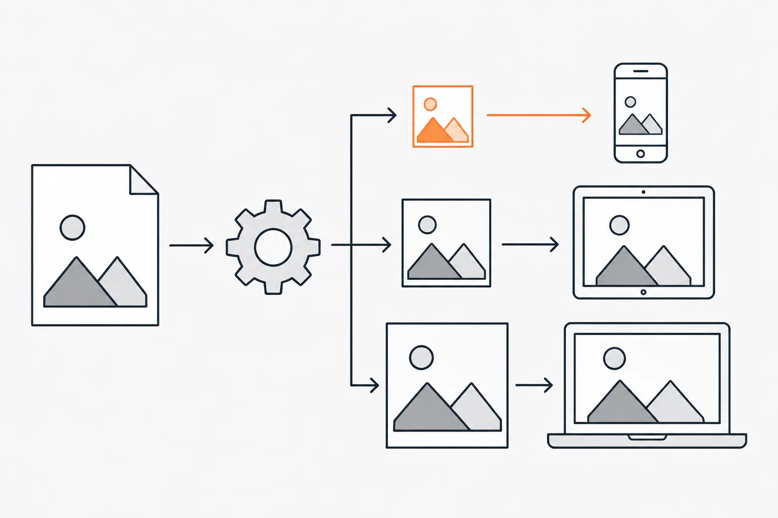
*The browser downloads only the size it needs, so a phone never pays for the desktop photo.*
Three more habits protect the Core Web Vitals:
- **Set `width` and `height`**, or a CSS `aspect-ratio`, on every image and video so the browser reserves the space before the file arrives. [web.dev](https://web.dev/articles/optimize-cls) lists images without dimensions first among the most common causes of a poor CLS.
- **Never lazy-load the main image at the top of the page.** It is often the LCP element, and [web.dev warns](https://web.dev/articles/optimize-lcp) that lazy-loading the LCP image always delays it. Give that image `fetchpriority="high"` instead, and use `loading="lazy"` only for images further down.
- **Measure real visits.** PageSpeed Insights and Search Console's Core Web Vitals report show field data from the Chrome User Experience Report. Lighthouse runs a lab test on a simulated device and cannot measure INP at all, so treat its score as a hint, not the result.
```html
```
## Make forms and calls to action easy to finish
A form is where a visitor turns into an inquiry, so it deserves more care than its size suggests.
- **Give every field a visible label.** Use a `
 ```
## Make forms and calls to action easy to finish
A form is where a visitor turns into an inquiry, so it deserves more care than its size suggests.
- **Give every field a visible label.** Use a `
```
## Make forms and calls to action easy to finish
A form is where a visitor turns into an inquiry, so it deserves more care than its size suggests.
- **Give every field a visible label.** Use a `